For the poster I wanted to return to the linocut printing that I’d tried out earlier but this time I wanted to create some of the architectural blocks that I’d settled on as my design motif instead of a pastoral scene with a bear. I cut out several blocks from lino and had a go at printing them onto a page in a cohesive design.
It quite quickly became apparent that this wasn’t quite working out how I’d hoped though. The small size of the tiles made them fiddly to print patterns with and the paper was getting really grubby from being handled repeatedly. Instead I decided that I’d opt for a mid point between physical print and digital design by printing each shape individually and then digitally importing and manipulating them on the computer:
Once I had the photos I quickly ran them through photoshop making them greyscale and turning up the contrast. From there I took them to illustrator and used the ‘Image Trace’ tool. After messing around with the sliders until they looked natural, I cut out the shapes as vector images. The resulting shapes looked pretty legit.
From there I added the shapes to a document and started playing around with layout. I decided that it was important to add the brand colours to the poster but I didn’t want to just use rigid boxes and rectangles to do so. I imported a brush texture instead and converted that into a vector image too. Using the two elements together I was then able to build up a really nice looking poster design that looked as if it had been hand printed even though it was composited on the PC.
Once I’d arrived at the idea to use architectural elements from Bristol’s buildings, changing them into simplified 2d forms and shapes and blocks I sat and considered what these design elements were actually communicating. It’s all well and good picking visually interesting architectural features from fancy old homes around Bristol to use but I’d need to consider the providence and history of the buildings I was choosing. If I just used flourishes from buildings owned or paid for by the wealthy merchants of the past I could inadvertently be communicating a kind of colonial or even racist message without realising it.
I started to delve into Bristol’s architectural history, specifically seeking out buildings around the city with connections to historic civil rights & protest movements, community empowerment, socialist politics etc. It didn’t take me long to start finding loads and loads of fantastically interesting architecture to use. The city even today has a whole district that self-identifies as a ‘people’s republic’ (Stokes Croft). Protest and community action are baked into the fabric of the city and so I started walking around both in person and through google maps for further away places. Through this research I gathered together tons of shapes and forms to use for this project:
Typography
I played around with a number of different options when it came to type but wasn’t happy with anything that I already had in my library. I took a step back and asked myself some questions to try and guide my choice. What did I want to communicate with this typography? I decided that what was most important was that it was friendly and welcoming and that it mirrored the rest of my strategy by being accessible to as many people as possible. I was conscious that I didn’t want to create something that looked really experimental and alien, I didn’t want it to look like a design student’s project basically!
As I sat and thought about these things I asked myself, what is the most commonly used typeface that you see around? Not Helvetica, sure it’s used a lot but it’s a little pretentious and not very friendly. Then I remembered a video I’d watched only recently –
Cooper Black was a typeface that was absolutely everywhere. It’s friendly and round but it’s almost the opposite of pretentious. You see cooper black on everything from barbershops to taxis, it’s such a widely accepted part of our shared visual language in the west, it was perfect.
I had a go at changing all of my titles to Cooper but there was something that didn’t sit quite right, I liked the bubbly round forms but it didn’t seem to gel with the rest of the design sadly. Undeterred however I headed to google fonts and searched for other rounded black typefaces, eventually finding the font that I would go with – Fraunces. Fraunces has all of the fun, chunkiness of Cooper but with a slightly more mature looking profile. Some of the roundedness is contained by more pronounced verticals and when i tried it in situ I immediately knew that this was the one.
Colour
I’d already decided to pull my colour palette from the colourful houses around Bristol but I wanted to take it one step further. I wasn’t content to just pull my colours from one of the fancy rows of houses in Clifton or Hotwells. Although prominent landmarks within the city sitting up on the hill, these are the houses of wealthy folks and aren’t very representative of the city as a whole.
Instead I thought to look further afield at a range of different parts of the city that represented a broader range of racial and socioeconomic groups. The point of CurioCity Collective is that it’s for everyone and so I decided that the best way to really communicate that was to draw from as many different people’s experience of Bristol as I could.
I was actually really pleasantly surprised as I toured around the different areas of the city though that a love of vibrant bright colours seems to be something that is universally shared across the place. Whether I ventured to the ethnically diverse area of Easton or the predominantly white working class area of Knowle West, bright friendly colours were everywhere:
EastonKnowle West
I decided that I’d draw up a list of six areas of the city that between them represented a really broad range of resident demographics. The list I settled on was:
Knowle West – Predominantly a white working class area
Easton – An area of the city with residents from many different minority cultures
St. Pauls – A central area of the city with a majority black population
Bedminster – South of the river, home to many of Bristol’s young adult & creative residents
Clifton Down – An area full of students
Hotwells – A wealthier part of town full of historic buildings
From each of these areas I found and took one colour for my palette. I also added black and and off-white and the resulting palette looks like this:
Between these three elements, the colour palette, the typography and the architectural motifs I believe that I’ve managed to build a thoughtful brand identity that is truly reflective of Bristol and which will have a broad appeal to the city’s young adults.
I created a questionnaire for feedback on the branding that I’ve designed for CurioCity Collective and passed it around as many people in my target demographic as I could find. In the end I had 57 responses, below are the results:
Q1 – How effectively does the design grab and hold your attention?
Q2 – Do you think that the branding help communicate the message or works against it?
Q3 – Do you feel as though the colour choices are appropriate for the brand?
Q4 – To what extent do the choices and use of font / typeface compliment the overall design?
Q5 – Is it clear what the design is for / what the group is about?
Q6 – Does this branding feel appropriate for Bristol?
Q7 – Pick two feelings that the branding predominantly evokes for you
One of the key deliverables for my project will be the design for a hype building microsite. I initially got the idea from one of the members of Evening Class that I talked with a few months ago. They explained that they had used a similar website to build initial interest in their project and that it was an excellent way to essentially put out a manifesto / call to action and get people excited about your project.
Their web presence remains super simple and to the point to this day:
Their whole website is basically 2 or 3 pages and a few external links.
Whilst I don’t think I want my site to be as reductive as Evening Classes’, a simple site offers a near unbeatable ability to spread our message quickly and so it’s a no-brainer must-have for CurioCity Collective.
The functions that I need the site to perform are:
Collect interested folks’ email addresses for newsletter,
Provide a way for people to sign up,
Explain our purpose / philosophy / how it all works,
Collect donations from supporters,
Link to social media channels,
Generate hype and buzz and encourage people to share,
With this in mind I went straight into Adobe XD to start pulling together a simple wireframe. I wasn’t too worried about design at this stage as functionality was my main concern.
I included things like a privacy policy and a sitemap in this draft which I wasn’t entirely sure about. Accessibility was my main concern at this point and I wanted to make sure that I was covering all my legal bases considering that we’d be collecting personal info through the site.
Another thing that I’ve been thinking about is that I’d love for the homepage to have an level of interactivity / play to it. Not only would it act as a way to draw people in but I’m interested in reflecting some of the complexity / contradiction that I’ve been exploring through my study of Bristol’s radical architecture. My only concern is that I don’t know whether I’ll be able to make an animated / moving proof of concept version in the time that I have left.
A website that manages to inject fun in a fairly simple way is Pair Up perhaps I could opt for something similar?
Emojis spawn on the screen periodically where your mouse has been. Simple but quite fun.
I shared my wireframe with a handful of friends and asked them to test it out, they were pretty unanimously in agreement that it all worked fine and looked good. There was a question raised about how necessary it was to include a privacy policy and sitemap on such a small site though which is valid. I may try cutting those out for now.
Next step for this project will be to design a couple of the actual webpages. I won’t be making a full working site at this time but I plan to produce a proof of concept for a future wordpress site or similar.
Bristol is a city with a huge number of different groups and community organisations already in existence. Throughout the past few months I have been reaching out to several of them to learn more about what they do, to share my ideas for a new kind of learning-focused collective and to enquire about what kinds of workspace are available around different parts of the city. Here is a summary of what I’ve learned and who I’ve spoken with:
Spaces –
TheWellspring settlement.
This is a community centre in the Barton Hill area. They were really friendly on the phone and were very proud of how embedded they are within their local community. They often host learning events for local disadvantaged adults and were interested in the potential for new learning events to take place at their centre. They usually allow local residents to book space inside for free but they seemed very relaxed and there is a good chance they’d let me book space to use.
Zion community cafe
A kind of arts-focused event space and community hub in Bedminster Down. I emailed back and forth with a man named Charles who was very positive and supportive of my ideas. They have two main spaces, a gallery and a cafe space – each can be hired for a reasonable cost at times when they aren’t otherwise being used.
Malcom X Centre
In St. Pauls which is an area predominantly occupied by BAME residents. They are well respected and powerful players in Bristol, I spoke with a lady called Primrose who is a really well known figure in Bristol. (She runs a radio show and I think she has a tv show on a local channel or something). Not sure she really connected with my ideas but she was generally positive about the need for more opportunities for young people, I got the impression that I could come to her with a more cogent idea and she’d be all for it. Not sure whether I could use space in the Malcom X centre regularly but perhaps for outreach stuff?
Tobacco Factory
As the name suggests an old factory in Bedminster that was run down until the previous city mayor George Ferguson saved and regenerated it. Now a hugely successful hub for all kinds of creative organisations and events. Not the cheapest space in the city but it’s a well-established location that could be useful to bear in mind.
BS3 Community centre(s)
The BS3 community group run two centres, one of which is totally focused on adult learning. Great ladies there that I spoke to, very passionate and they were well up for working together to run events in the future. Didn’t seem like it would cost me much as long as it was providing a benefit to local people which is what my project is all about!
Groups –
BSWN – Black South West Network
Amazing group, really inspirational they do loads of work supporting disadvantaged (esp. black) folks in Bristol. They are all about upping social inclusion and when I spoke to them on the phone about how my group might be a great way to help bring an alternative form of education they were well into it. A strong link into communities that are otherwise not so easy to reach.
Mogul Minded
BAME-led local magazine that’s all about supporting Bristol’s young entrepreneurs and creatives. Great people who run it, had a zoom chat which was really positive they were up for amplifying our voice through their platform and potentially helping us reach more interested people.
Full Circle @ Docklands / Freestyle Bristol (Delroy Hibbert)
I spoke with a guy here called Del who does loads in Bristol to support young people and to help them to aspire to greater things. He also runs a social platform called Freestyle Bristol for young creatives. He was super passionate when we spoke on Zoom. He was happy to see that there were more people championing education within Bristol and gave me a bunch of contacts. We spoke about using some of the spaces that he runs and he was up for helping us to find spaces that fitted our needs. A solid contact moving forward who knows all the right people in Bristol.
I have decided that the first and most important designed outcome for this project will be a brand outline document which will detail the specifics around the project’s brand identity. For this I’ve tasked myself with creating a name, a logo, choosing a typeface, choosing a colour scheme and creating an outline of how each brand element works together. I would also like to create a tagline here or short punchy description of what we are.
In order to start generating a lot of ideas the first thing I did was to employ the help of some local friends who fit into the target demographic of mid-twenties graduates. I plied them with pizza and snacks and we sat down together to spitball a whole bunch of different ideas for names, themes etc. Some of the outcomes are here:
Since my conversation with Jonas prompted me to move away from using the term ‘graduate’ in my title I’ve needed to come up with a different branding direction. There were actually quite a few ideas that were expressed during this workshop that had merit though I thought. Some of my favourites are:
Curiocity – simple, speaks for itself. Nice and open, makes it clear that it’s for the whole city.
Constellations / Galaxy / Nebula theme – lots of individuals making up a bigger whole, interactions between members provide fuel and energy and new life. Really nice theme idea if I can figure out a name that works well, best I have so far is ‘local cluster’ which isn’t amazing.
Mycelial network / roots theme – underground connections, plays on the idea of being secret or hiding in plain sight. Hidden potential etc.
Something irreverent and a bit cheeky – a few ideas were thrown around but we liked the idea that it might be a bit cool & contemporary – perhaps even a bit rude. This would play well with the target audience of younger adults more engaged with memes and colloquialisms
We also discussed imagery and colour theming in our workshop which was similarly very fruitful. We first touched on what kinds of things we all liked about Bristol’s aesthetic and about different brands that aimed themselves towards younger audiences. We all agreed that we really loved the simplicity of brands like extinction rebellion for their chunky graphics and bright colours. Being bright and colourful was generally agreed as a good thing for a project like this with more monotone or limited palette brands feeling more ‘corporate’ and less DIY.
We all liked the bright and fresh graphic style of ER
Branding like this was a real turn off for the group.
As the discussion went on we started to talk about how I might design something that appeals to the target audience. We discussed how it should be DIY and genuine without being simply naive and poorly executed. We started talking about woodcut and linocut design and discussed how this technique had been used by collectives and groups throughout history to spread information about collectives and groups such as the Diggers and the Levellers.
We liked the connection that these simple printing methods had to folk history and to protest art, the style seemed fitting for Bristol which itself has a storied history of protest and anarchism. We agreed that this technique brought just the right amount of handmade aesthetic, if executed correctly it could be the perfect way to signal to our target audience that we ourselves were grassroots and DIY.
We concluded that combining elements of linocut design with bright bold colours was a design direction worth me exploring. We also created a shared moodboard of ideas contributing imagery together via our phones which I put together on the screen:
Colours –
We’d decided that bright colours was a good way to go but I wanted to find a way to tie that back into Bristol and Bristol’s identity. We discussed what different colours might best represent the city – we thought about it’s history, it’s present, landmarks etc. but we couldn’t come up with anything suitable during our workshop.
It was actually the next day as I was walking to my friend’s house in the Hotwells part of the city that an idea struck me – Bristol has become famous over the past few years for it’s bright, colourful rows of houses. In several places throughout the city people have painted their houses different colours. It’s a really lovely, simple idea but it has become an integral part of the city’s identity over the past decade or so. I figured this could be a really nice way to pull part of the branding straight from the character of the city itself.
Ambrose Road – Hotwells
Anglesea Place – Clifton
The Polygon – Hotwells
Redcliffe Parade – Redcliffe
Name decision – CurioCity Collective
After much toing and froing I decided to change the name to CurioCity Collective. The curiocity part was a suggestion from my workshop that I had really enjoyed but at the time couldn’t quite make work in my head. I’ve spent the last few days making notes, scrawling different ideas and combinations of words together but I think this one works the best. I felt it was important to signal what kind of group we were within the name itself. Moving away from Graduates’ Guild was fine & I agree that it was a good decision but I was really happy with how the word Guild did a lot of the heavy lifting in that title.
I tried a bunch of different ideas and ways to incorporate words like guild, collective or union into the title but in the end CurioCity Collective was the best that I’ve been able to arrive at in the time I have. With that in mind I started to pull together different imagery and ideas around the idea of curiosity to try and arrive at some kind of logo and brand imagery:
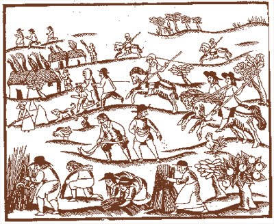
I actually really liked this picture of a bear looking through the telescope that I found, it was charming and I thought really exemplified visual curiosity. I wondered whether I could extrapolate it out into a design for a linocut, perhaps adding a couple of other animals (other bears or woodland creatures) to signify the ‘collective’.
Making a linocut design
I started with the bear image and crudely added in some other animals using photoshop. I then printed this off and used a piece of acetate to trace the outlines of everything I wanted to carve with a sharpie. From there I used an awl to imprint the design on to a square of lino.
I then used a pencil to draw the design more clearly onto the lino. Next time I’ll just use a marker pen I think, the pencil smudged a lot as I used it.
Eventually I was able to cut out the design, it took longer than expected
The end result turned out much better than I was expecting though I’m not really sure that the design is right for this project. I used the back of a spoon to rub the design onto the paper which worked well and allowed me to make sure all of the design transferred.
Playing around with colour palettes
I wasn’t that happy with the bear but I used it as a stand in for the time being. Using the colours that I had taken from the houses around Bristol I put together a number of different colour palettes.
I also started playing around with other ideas – looking at the windows of the various houses around Bristol which have a lot of variety. Looking to the city itself for inspiration might be a good plan. I mocked a couple up quickly in illustrator but I wasn’t really a fan of how it looked.
I did some more experiments with the bear design but It just served to make me realise that this was a dead end. I tried some more linocutting, designing a wordmark but that didn’t work out either:
I decided to change my direction and instead started looking around Bristol for interesting architectural features. I figured that the diversity of forms could convey a sense of the diversity of people and of thoughts that the group champions. I was particularly interested in finding some of the historic buildings around Bristol that were built by philanthropic businessmen of the past. There are many Almshouses around Bristol as well as several public amenities that were designed and built for the betterment of the people of the city. I like that connection, I think it marries well with the aims of the collective. I started to put together a moodboard:
I spent a couple of hours in google maps and found hundreds of really interesting architectural features from all around the city. I started to use some of them to make sketches and to play around with some ideas of composition:
I had been inspired by a couple of street artworks that I’d seen around Bristol too that used intersecting items on flat planes to build up a composite picture. I figured this would be a great way to build a design that incorporates many different style elements.
I worked iteratively on the design changing parts and adding in different architectural elements until it was cohesive. The typography is just a stand-in at this point but I really like this direction I think it works a lot better than the handcut print stuff. It still incorporates a lot of the bright colours from the houses that I wanted to keep and these kinds of flat patterned designs would work well as prints when it comes to designing flyers and posters.
This week’s webinar centred on the development of a personal design brief to help us focus in on the deliverables each of us hoped to produce as an outcome to our studio practice. I had been finding it quite difficult to focus back on design after being so deep in research up until this webinar & so I found it particularly helpful as a kick start to get my brain thinking in this way again.
We were asked to separate out our brief into four areas – Deliverables, content, production methods and production schedule. Each of us wrote up in as much detail as we could our plans for these four areas and then shared them back with each other in groups. Here are mine from the webinar:
I’m pretty happy with this workload and these outcomes, the brand identity document will be the most important by far and I expect that it will take the longest to refine, as such I’ve decided to work on that first giving me overspill time into the following two weeks should I need it.
Alongside these design tasks I will of course also keep refining and developing my business plan. I’ve given myself a soft deadline of 1 week before the submission to have a draft completed of the report, this gives me time to work on the design and to work out any kinks before submission. I’m going to have to manage my time really well over the coming weeks to ensure that I’m able to pursue both elements at the same time. Should anything go wrong or should I fall behind schedule the 1 week that I’ve given myself to work on the promotional materials can instead be given over to working on the report. On the whole I feel good about this plan, it’s structured in what I think is a good way. I’ll cover each week’s specific schedule closer to the time but a rough timeline of my plans is as follows:
The start of this week saw Ashleigh and myself swapping essay drafts and constructing some feedback for each other. I found this really useful, not only was it good to have a fresh pair of eyes look at my work but it was also really helpful to see how she had approached her write up and to note the differences between our styles. Ashleigh’s feedback was positive on the whole which was a big relief and I think we both got a lot out of the experience.
The second major event of the week was my introductory chat with the new tutor Jonas. This was a little more frustrating. He rightfully challenged my decision to exclusively target graduates, telling me that by doing so I was excluding others that might want to take advantage of what my proposed group might have to offer. I did my best to explain why I thought it was important for graduates to feel like this was for them specifically and then we discussed how things can be coded in a certain way to signal to certain groups that something is for them without it being explicit. After some back and forth (I really wanted to cling to the name Graduates’ Guild!) I ultimately agreed with his position. This meant that I had to go back to the drawing board with a couple of aspects of the project though which was frustrating at this stage of the process. If I could have had this chat 2-3 weeks ago before I’d written so much of my business plan that would certainly have been preferable!
Who is the project for then?
I sat down and had a good long chat with my partner after meeting with Jonas. This was really helpful as we really got into the specifics of who I want to help with this project.
In a nutshell what we arrived at was that the project was about supporting overeducated and under stimulated young adults. What we’re referring to here is still predominantly graduates but by focusing on this aspect of what ails the graduate population we open the door to others that meet the same criteria and that want to get involved.
Another key notion that we discussed was the idea of ‘brain drain’ – (I hate the phrase itself but the phenomena is well documented). Brain drain occurs when we no longer engage with or think about the things that we have already learned. When we stop actively engaging in this way it can take a surprisingly short time for us to start forgetting things which in turn makes us lose confidence. I think that brain drain is an important focus for this project and also a potentially viable way of marketing and promoting the idea to others.
Susanna’s webinar – Playing around with Crazy 8 design sprint
In light of the various project changes this week, a chance to work on a design problem with others was very welcome and Susanna’s webinar provided just that. I posed the question ‘If not a Graduates’ Guild then what? If I’m no longer directly marketing to an exclusive graduate market, what ideas and themes can I use to base my marketing and my core ethos around?’
I was really eager to find a better, more suitable focus for the project and through the webinar I was able to arrive at one.
Though Lindsay and I struggled to get going at first, eventually with Susanna’s input we arrived at an interesting idea. We discussed how one lens we could view the project through was that of exchange. At their core many of my ideas thus far have been about exchange – exchanging academic knowledge, exchanging experiences between young adults and local communities, exchanging skills and competencies with others etc. When we think about the project in these terms it actively does away with any previous subconscious and explicit hierarchies.
So that will be my focus moving forward as I experiment and play around with possibilities for how this project all comes together.
The plan with the Graduates’ Guild is to focus on three key areas:
The idea is that as a community we’re working together to make connections, support each other and help each other to develop ourselves.
How does it work financially?
Members pay a monthly fee to the guild of £10.
That money is then pooled and split into three pots.
Each month a poll goes out to all members asking what kind of support they’d most like that month, majority vote decides what we invest in as a group that month. 1/3 of money raised from membership goes towards paying for as much of a professional’s time as we can afford. If there is a high demand for a particular service, more than we can afford then members will be drawn from a hat to receive a slot of time with the support person.
As the group grows more time could be paid for and potentially we could even look to take someone on permanently in a supporting role or pay for multiple freelancers each month.
Guild members with support skills will also be encouraged to volunteer some of their time to fellow members where they’re able.
The rest of the funds are used to pay for space and materials needed to deliver a range of events throughout the month. These will change from month to month, new ideas for events are welcomed and over time certain events will likely become popular enough to happen regularly. A mix of events to accommodate different personality types and interests will be arranged with some events marked as ‘sober’ non drinking events.
Down the line, should the group continue to grow then larger events will be planned such as big members only club nights and excursions. Eventually the plan would be to have a large enough membership that we could lease our own premises within the city which would be ‘members only’ and where we would host a proportion of our events.
Why become a member?
Gain access to exclusive events in the city
Members receive a membership card – feels cool to be part of something
Down the line we could try to partner with businesses to get members discounts
I’m writing this in the second week of the May break, I had to take some time away from my project to gain a little perspective I think. I was running out of motivation and my project had changed so much from my initial ideas that I wasn’t even sure that this was something I really believed in anymore. My original plan for weeks 11 and 12 had been to start focusing on the actual brand identity & design of my outcome but in the end it became a kind of unofficial hiatus to recharge and refocus myself.
Even though I didn’t achieve what I’d hoped to over the past few weeks, the time wasn’t entirely wasted. I spent some time compiling visual research into a moodboard and started to plan out the various sections of what will eventually become my business plan.
My hope now is to get back on the horse having taken some time off and to push forwards with both of these aspects of the project over the rest of the May break.
Coming up with a name that works.
One of the main things that I struggled to work through in weeks 11 and 12 was that I couldn’t figure out a catchy name for the project that was suitable for my needs. I’ve established that what I want to design was a ‘students’ union for graduates’ but the question I couldn’t answer was how to communicate that idea through a name without it sounding like it was affiliated with or owned by one of Bristol’s universities. As I’d established in my chat with Amy, such an affiliation could be a major put-off for a lot of graduates that have moved to the city and not studied there themselves. It could signal that this group isn’t for them which is the opposite of what I want!
I spent ages on this problem, probably a lot longer than I should have but I figured that before I could start thinking about the branding and identity it was important to know what the hell the thing was called! In the end I came up with something that I’m really happy with. I decided that I couldn’t use the word ‘union’ at all in the name, it has too specific a connotation. When paired with the word ‘Graduate’ it immediately makes you think of a university society. What I landed on was ‘The Graduates’ Guild’. It’s snappy, alliterative and the initials GG are fun to work with. GG is often used as a shorthand way of saying ‘good game’ at the end of an online video game and because of this common use the term has bled through into more common parlance too with a lot of younger people using it in texts and messaging to generally mean good job or well done. It’s a positive association that’s a little bit fun too and I think it works well for the concept. Guild also works well here I think as an alternative to union. The word implies a level of exclusivity, community & the sharing of knowledge that is perfect for my needs.
The next step for me is going to be to really flesh out what the parameters of this business idea are as up until this point they’ve been somewhat nebulous and changeable. I have a pretty solid idea at this point of what it would look like and how it would fund itself but I need to get it down on paper before I can do much more with my business plan or my design work.